Flexbox 基本概念 04
justify-content 是設定 Flexbox 中物件的對齊方式 (Flexbox 基本概念 03),而 align-items 設定也是設定物件如何對齊,分別是什麼?又如何應用呢?
上文提到,justify-content 是會跟據 Flexbox 中的排序方向 flex-direction 而設定對齊,例如排序方向是橫向 row,justify-content: center 即是橫向水平置中;align-items 就剛好相反,它是用作另一個軸 (cross-axis) 的對齊方式,在上述例子中,align-items: center 便會變成為設定垂直置中。
看看以下例子:
HTML
<div class="container">
    <div class="item">item 1</div>
    <div class="item">item 2</div>
    <div class="item">item 3</div>
</div>
CSS
.container {
display: flex;
flex-direction: row;
justify-content: flex-start;
align-items: center;
height: 250px;
background-color: cornflowerblue;
padding: 10px;
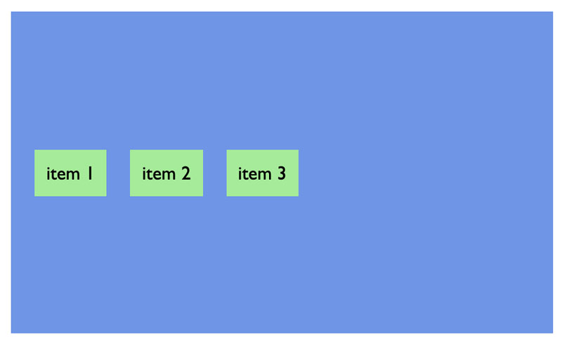
}flex-direction: row 及 justify-content: flex-start 將 container 定義為橫向排序及開首對齊
由於排序為橫向設定,align-items: center 便將 item 設定為垂直縱向對齊
如果將排序方向轉為縱向 flex-direction: column,就會出現這個效果:

justify-content: flex-start 就會將 item 由頁頂垂直向下排
align-items:center 現在就變成水平橫向置中了
另一點要留意的,若設定 align-items: stretch,就變成默認的顯示方式:

CSS
.container {
    display: flex;
    flex-direction: row;
    justify-content: flex-start;
    align-items: stretch;
    height: 250px;
    background-color: cornflowerblue;
    padding: 10px;
}