Flexbox 進階篇 02
Flexbox 空間(container)當中的物件(item)除了可以設定 order (進階篇 01) 外,還有一些能控制個別 item 如何顯示(大小)的設定,包括:flex-grow 、flex-shrink 及 flex-basis。
flex-grow 是用作控制當 item 向外放大至填滿 container 時,放大的相對比率。留意以下例子:
HTML
<div class="container">
    <div class="item one">item 1</div>
    <div class="item two">item 2</div>
    <div class="item three">item 3</div>
</div>
CSS
.container {
display:flex;
flex-direction: row;
height:250px;
background-color:cornflowerblue;
padding:10px;
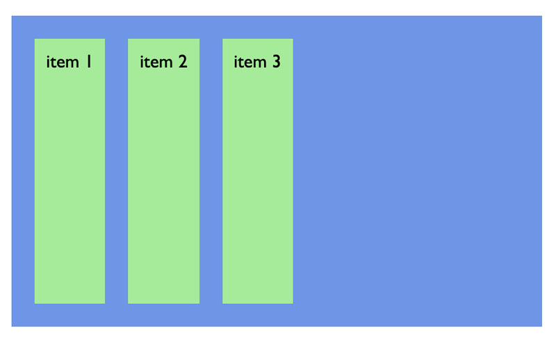
}當為 item1 加入 flex-grow:1 時:
CSS
.one {
    flex-grow: 1;
}
flex-grow 的默認值為 0(item2 及 item3)
由於 item1 的 flex-grow 是1,而其它是0,item1就會自動放大,填滿所有空間,而 item2 及 item3 維持大小不變。
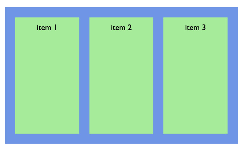
若分別將 item2 及 item3 也加入 flex-grow:1 的設定,由於每個 item 的放大比率也一樣,就會形成相同比率地放大至填滿 container:
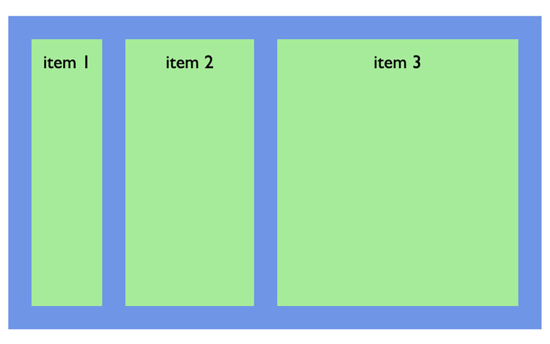
最後,看看若把每個 item 的 flex-grow 設定為不同時:
CSS
.one {
    flex-grow: 0;
}

.two {
    flex-grow: 1;
}

.three {
    flex-grow: 3;
}
item1 不會放大
item3 的放大比率會是 item2 的3陪